The work doesn’t stop, and neither will we.
We continue to be steadfast in our commitment to center the voices of the marginalized, invest in long-term strategies that lead to systemic change, and fund nonprofits working closely with those most impacted by the dynamic issues in our region. Join us as we create a joyful region of shared prosperity, belonging, and justice.
Seattle Foundation has guided philanthropy in our region for 79 years.
As your community foundation, Seattle Foundation believes community is more than a place—it’s the shared understanding that our joy and well-being are tied to one another.
Every day we work with nonprofits, philanthropists, and partners like you to strengthen community by igniting powerful philanthropy and advancing long-term solutions.
Because it takes all of us to create a joyful region where every person can thrive.
As a partner to community leaders and an advisor to donors who care deeply about their philanthropy, we are combining resources, expertise, and time to magnify impact and create a joyful region rooted in belonging and shared prosperity.
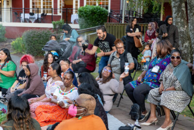
Explore our recent gatherings and events to see how we are bringing people together to be part of something greater than ourselves: a joyful Seattle where everyone can thrive.

1,200 community philanthropists
work with Seattle Foundation to create lasting change
Seattle is thriving for some, but not all.
Over the past decade, Seattle has experienced significant growth and a flourishing economy. While many may consider Greater Seattle a joyful and prosperous region, much of this wealth and influence is concentrated among a few, leading to a growing divide within our neighborhoods. This stark and widespread inequity has given rise to challenges that can’t be tackled alone. Solving these issues requires many different people and organizations to work together to find real, long-lasting solutions.
As we’ve gone through our journey in philanthropy, at each stage there have been partners, friends and colleagues thinking the same thing: how do you go from direct service to systems change, how do you focus your giving to have more impact.”
—Janet Levinger, Seattle Foundation philanthropist and trustee

Read how Janet and her husband Will use Seattle Foundation to make a bigger impact
Featured stories
- Multiple Identities/Multiple Realities | N2N Summer Spotlight
 Neighbor to Neighbor Summer 2024 Spotlight By: Aileen Balahadia Intersectional is a word that is often thrown around and used, but what does it mean in the context of the grassroots communities we serve in N2N? For two of our grantees this Summer, both the vibrancy of and the challenges that arise from multiple identities… Read more: Multiple Identities/Multiple Realities | N2N Summer Spotlight
 - Welcome Lindsay Goes Behind
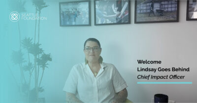 By: Alesha Washington When I reflect on this year, I am heartened by the progress we are making at Seattle Foundation. We are in a healthy financial position, allowing us to invest in the systems and infrastructure to maximize our operations and services. We are creating more experiences to engage our philanthropists on key issues… Read more: Welcome Lindsay Goes Behind
 - Celebrating Board Leadership
 Seattle Foundation is guided by a strong board of trustees who care deeply about our community. We are excited to share some new board appointments, introduce a new board member, and celebrate trustees completing their tenure. Honoring Ed Taylor Dr. Ed Taylor, vice provost and dean of Undergraduate Academic Affairs at the University of Washington,… Read more: Celebrating Board Leadership